For the past two years or so, I have been making large scale drawings on fairly inexpensive paper that comes on a 60 inch wide roll.
http://www.bordenandriley.com/View/116-Artist-DrawingSketch-Vellum-Rolls
It has not been a bad paper to work with, but due to the size of these drawings, I would like to use something with a little more body; more impervious to denting and damage during transport and storage, and that might possibly be able to hang unframed. Since some of the higher quality papers can run about $200 per roll, I decided to experiment before investing
Aside from a heavier body, the main characteristics I am looking for are:
· Available in as wide a roll as possible
· Ability to yield really dark darks
· Ability to take erasing without degradation of the paper surface
I prefer not to erase if possible. I like to let the drawing process show, plus I really don’t like how erasing mars the surface of the paper. Of course, I do erase occasionally and sometimes more than occasionally. So I am taking into account the paper’s ability to withstand some erasing. In this respect, the less expensive paper won out over all of them.
In these drawings I use primarily vine charcoal in a variety of sizes. I use some conte for sharp, dark lines, and sometimes use black pastel for really dark areas. Maybe a charcoal pencil for tiny lines. That’s pretty much it. This post does not address the compatibility of these papers with any other materials or techniques.
Round 1:
Last spring, I did one drawing on BFK Rives (White, 140 lb):
 |
| Tree I |
I initially loved the feel of this paper. It is thick and velvety, almost fleshy. However, on this complex drawing, I definitely did some erasing, and I found that even minimal erasing with a soft, kneaded eraser really mars the surface of the paper, pulling up little rolls of lint. The subsequent marks on the erased patches have a different texture, and you can forget about erasing a second time. Love affair over. We are still friends, though. I have used it for printmaking, and maybe if I go back to my no-erasing rule, I will try it again.
Round 2:
I chose 4 more papers. All of these papers mention charcoal in their list of applications. Each one is available in a wide roll(although not as wide as I am used to), and each is available in 22×30 sheets from my local
Cheap Joe’s.
I decided to kill two birds with one stone by doing a series of flag drawings-honing my drapery skills while testing papers. I guess to be absolutely scientific in my endeavor I should have drawn the same flag on each of the 4 papers, but I don’t think I would have lasted through that.
Here are my results:
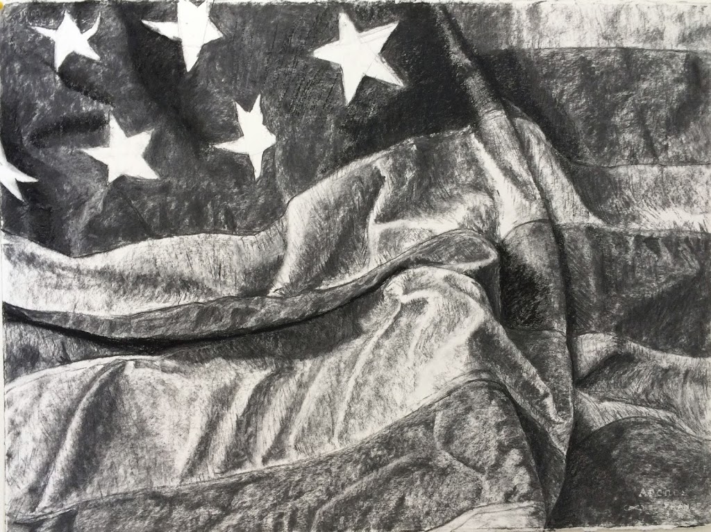
Fabriano Artistico (140 lb.)
 |
| Flag I |
This was the first flag drawing and my least favorite paper. To begin with, I had trouble making very light marks-one of the keys to avoiding erasing. The bigger problem, however, was the laid pattern. I don’t mind texture, but this laid pattern creates a pronounced and geometric pattern of dots. This is particularly bothersome in the lightly shaded areas, such as the shadows in the white stripes.
 |
| Detail of laid pattern |
Aside from erasing, the other thing I don’t like doing is “shading” using a blending stump or (yuck) fingers. I know some artists do it nicely but I prefer to obtain a range of shades through varying the pressure used. In this case I ended up breaking my own rule and using mineral spirits to try to distribute the charcoal more evenly. It sort of worked but not really to my satisfaction. This paper also did not allow me to build up the darks as much as I would have liked, despite the texture of the surface. It did accept erasing with better results than the BFK Rives. It may be that the laid pattern is useful for a specific subject matter, but it doesn’t appeal to me currently. The back side has the same texture. I wish I did like working with this paper because it is the widest (59 inches) I have seen in higher quality papers.
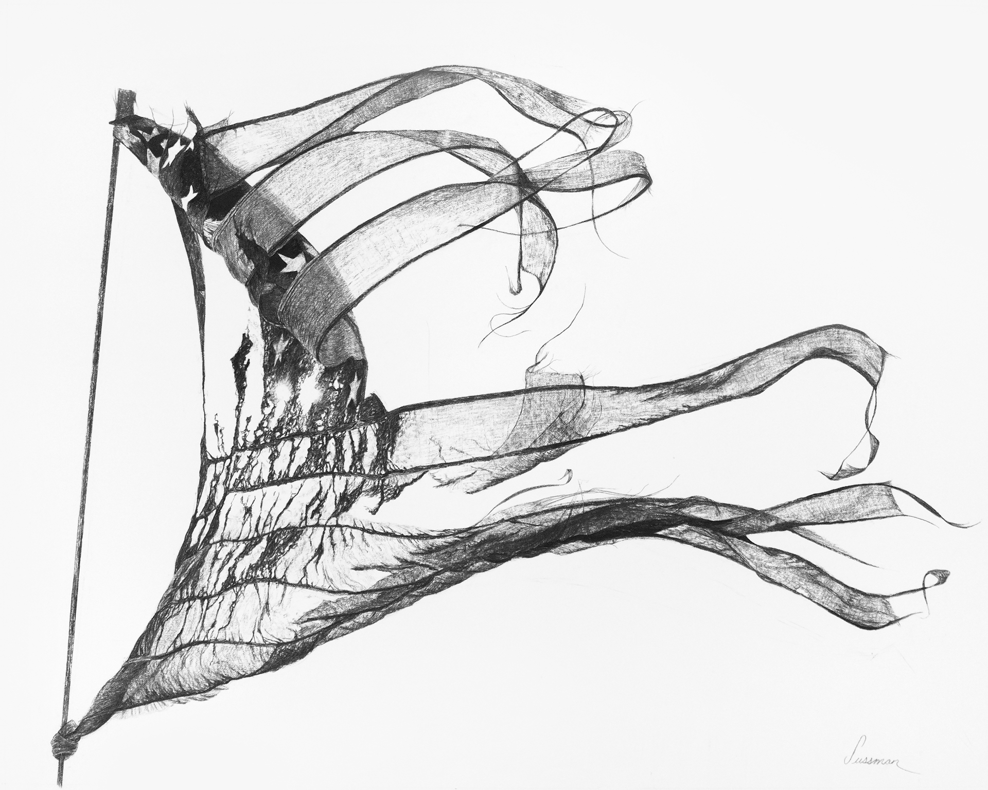
Arches Watercolor Paper, Cold Pressed (Bright White, 140 lb.)
 |
| Flag II |
This paper is currently my front-runner. It has a noticeable texture but since it is produced from felts rather than mesh, it has a more organic feel than the patterned texture of laid paper. Although erased lines leave a fairly strong ghost, the paper surface stood up to the friction better than some of the others. Apparently this is due to the sizing. The texture did allow for some pretty dark darks and sharp lines, which I liked. As watercolor paper it is meant to be able to stand up to wet media without buckling, so it has a pretty sturdy heft. I would even call it stiff in comparison to some of the others. I think that might give larger drawings a nice presence.
Arches Watercolor Paper, Hot Pressed (Bright White, 140 lb.)
 |
| Flag III |
Onward to Flag number three. The nature of hot pressed paper is that it is smoother than cold press. At first I did like the smoother texture and I think it might be nice for someone doing smooth, subtle shading, or working in graphite. Light lines erased well but the surface did abrade a bit. The biggest problem with this paper was the inability to build up darks. After a certain point the surface cannot hold any more charcoal, and the dust simply falls off the paper. Subsequent applications really just push the charcoal around on the surface, rather than sticking in place. I relied heavily on a black pastel to get the darkest areas. The overall look is much softer than the Arches cold press, without the ability to get really crisp lines or dark darks.
Stonehenge (White, 90 lb)
 |
| Flag IV |
The final flag was done on this paper. The surface of the paper is fairly smooth and this was the least hefty of the four. As a matter of fact, at 90 lb., it’s no heavier than the B&R paper I started with. Initial light lines did seem to erase, although some left a ghost. However, repeated erasings definitely chewed up the surface, and I had the same problem creating dark darks-at a certain point, there just isn’t enough tooth to hold the charcoal and it just falls away. This paper left me neither here nor there. Not a bad paper, but probably won’t make the cut for the next round.
Conclusions
I have drawn (no pun intended) two conclusions from this experiment:
1) The B & R paper really isn’t a bad performer for the price, although I haven’t subjected it to the same scrutiny as the papers above. I think it held up to erasing pretty well and allowed for darks and sharp lines. I don’t know if my opinion would be different after working with the more expensive papers. If it were just a little bit sturdier, I might have stayed with it.
2) I’m not done experimenting. I have purchased a couple more sheets of Arches cold press and begun a new drawing. I have also run across a brand called Lanaquarelle which is new to me but which seems to get good reviews for charcoal use. It should-it is twice as expensive as the others-but I might try it. I have a piece or two left of Rives BFK and I might try it with a strict no erasing approach.
3) The final idea is one I have been tossing around for a while now-forget the paper altogether and draw on canvas. I will begin researching grounds and prep asap.
What about you? I would love to hear your experiences with charcoal and paper. Anyone try charcoal on canvas? How did that go?